Both web and mobile applications perform operations associated with time delay, for example, initial loading of applications, etc. These time delays cannot be avoided and may lead to end-users becoming more impatient and frustrated. A progress bar offers better communication to end-user and differentiates from indicating an application is stuck.
The circular progress bar will have the following features which are typical for both the React JS & React Native applications:
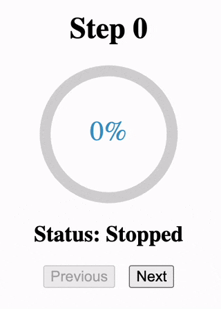
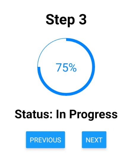
- Display the progress status of stopped, in progress, and done.
- Render progress percentage with the circular progress bar on the screen.
- Increment progress on button click.
- Decrement progress on button click.
1. Install the external NPM packages
Including an external NPM package as a dependency in the package.json provides imports of reusable components and avoids creating the functionality from scratch.
- React JS: “react-circular-progressbar” NPM package provides a circular progress bar component in React JS.
- React Native: “react-native-progress” NPM package consists of progress indicators and spinners for React Native apps.
// Package for React JS
npm install --save react-circular-progressbar

// Package for React Native
npm install --save react-native-progress
2. Define React state to track the progress
The React state functionality is common for both React JS and React Native, hence the code snipped is the same for both projects. Any update through setState() automatically re-renders the screen based on the updated value.
const [step, setStep] = useState(0);The value of declarations “progress”, “percentage” & “status” conditionally determined based on the React state.
// Progress from 0 to 100
var progress = step > 0 ? step / 4 : 0;
var percentage = 100 * progress;

// Status from "Stopped" to "Done"
var status = step > 0 ? (step < 4 ? "In Progress" : "Done") : "Stopped";
3. Render Circular Progress bar
React JS
The “react-circular-progressbar” package doesn’t automatically include CSS styles for the component, hence we need to manually import “styles.css” from the package directory.
import { CircularProgressbar } from "react-circular-progressbar";
import "react-circular-progressbar/dist/styles.css";
Previously determined “percentage” variable is passed as value & text for reusable <CircularProgressBar/> component imported from react-circular-progressbar” NPM package.
<h1>Step {step}</h1>
<div className="progress-container">
  <CircularProgressbar value={percentage} text={`${percentage}%`} />
</div>
<h2>Status: {status}</h2>
React Native
For React Native, the combination of <View> and <Text> components are used to display styling with the text. The <Progress.Circle/> component requires additional props like progress, showsText, thickness, etc.
import * as Progress from 'react-native-progress'; <View style={styles.header}>
<Text style={styles.headerText}>Step {step}</Text>
</View>
<Progress.Circle size={120} showsText={true} thickness={5} progress={progress} />
<View style={styles.status}>
<Text style={styles.statusText}>Status: {status}</Text>
</View>4. Increment Progress on Button click
The Next button increments the “step” state value and the progress bar automatically increments by 25%.
<button
onClick={() => {
setStep(step + 1);
}}
>
Next
</button>In React native, we use <Button/> component provided by “react-native” package over standard HTML <button/> element.
<Button
onPress={() => {
setStep(step + 1);
}}
title="Next"
/>5. Decrement Progress on Button click
The decrement functionality is very similar to increment except for the “step” state to be decremented by 1.
<button
onClick={() => {
setStep(step - 1);
}}
>
Previous
</button>6. Add Min and Max progress limits
The progress bar must range from 0% to 100%, therefore decrement functionality must be disabled when progress is 0% and increment functionality must be disabled when progress is 100%.
<button
onClick={() => {
setStep(step - 1);
}}
disabled={step === 0}
>
Previous
</button>
<button
onClick={() => {
setStep(step + 1);
}}
disabled={step === 4}
>
Next
</button>React JS – Solution Code
App.js
import React, { useState } from "react";
import { CircularProgressbar } from "react-circular-progressbar";
import "react-circular-progressbar/dist/styles.css";
import "./styles.css";
export default function App() {
const [step, setStep] = useState(0);
// Progress from 0 to 100
var progress = step > 0 ? step / 4 : 0;
// Status from "Stopped" to "Done"
var percentage = 100 * progress;
var status = step > 0 ? (step < 4 ? "In Progress" : "Done") : "Stopped";
return (
<div className="app">
<h1>Step {step}</h1>
<div className="progress-container">
<CircularProgressbar value={percentage} text={`${percentage}%`} />
</div>
<h2>Status: {status}</h2>
<div className="action-container">
<button
onClick={() => {
setStep(step - 1);
}}
disabled={step === 0}
>
Previous
</button>
<button
onClick={() => {
setStep(step + 1);
}}
disabled={step === 4}
>
Next
</button>
</div>
</div>
);
}styles.css
.app {
height: 100vh;
display: flex;
flex-direction: column;
justify-content: center;
align-items: center;
}
.progress-container {
height: 150px;
width: 150px;
}
.action-container {
display: flex;
gap: 15px;
}
.action-container button {
font-size: 16px;
}React Native – Solution Code
import * as React from 'react';
import { Text, View, StyleSheet, Button } from 'react-native';
import * as Progress from 'react-native-progress';
export default function App() {
const [step, setStep] = React.useState(0);
// Progress from 0 to 100
var progress = step > 0 ? step / 4 : 0;
// Status from "Stopped" to "Done"
var status = step > 0 ? (step < 4 ? "In Progress" : "Done") : "Stopped";
return (
<View style={styles.app}>
 <View style={styles.header}>
   <Text style={styles.headerText}>Step {step}</Text>
 </View>
 <Progress.Circle size={120} showsText={true} thickness={5} progress={progress} />
 <View style={styles.status}>
   <Text style={styles.statusText}>Status: {status}</Text>
 </View>
<View style={styles.buttonContainer}>
<View style={styles.button}>
<Button
onPress={() => {
setStep(step - 1);
}}
disabled={step === 0}
style={styles.button}
title="Previous"
/>
</View>
<View >
<Button
onPress={() => {
setStep(step + 1);
}}
disabled={step === 4}
title="Next"
/>
</View>
</View>
</View>
);
}
const styles = StyleSheet.create({
app: {
height: 800,
display: "flex",
flexDirection: "column",
justifyContent: "center",
gap: 100,
alignItems: "center",
},
header:{
marginBottom: 20,
fontSize: 20
},
headerText:{
fontWeight: "bold",
fontSize: 30
},
status:{
marginBottom: 20,
marginTop: 20
},
statusText:{
fontWeight: "bold",
fontSize: 25
},
buttonContainer: {
display: "flex",
flexDirection: "row",
},
button:{
marginRight: 35
}
});


