Create Modal in React JS with Overlay

The modal is a window that is displayed over the existing application and de-activates the functionality of the rest of the content. Modals are often used to direct users’ attention to take action or view a message from the application.

In this article, we will build the following features:

  1. Display a Modal with an overlay on button click.
  2. Display messages and actions inside the Model.
  3. Hide the Modal when closed by the user.
react modal

Modal with Overlay in React JS

1) Add “react-overlays” npm package to package.json

The “react-overlays” provides access to multiple overlay based UI-components such as dropdown, modal, overlay, etc. The package can be installed through the following command.

npm i react-overlays

// For projects configured with yarn 
yarn add react-overlays

2) React state to control Modal visibility

The <Modal/> component needs to be displayed and hidden dynamically, hence React state is required to manage the visibility. The Modal will be hidden by default, therefore the initial value of React state should be false.

const [showModal, setShowModal] = useState(false);

3) Declare the handler functions

When triggered, the close functionality hides the modal from the screen, and the save function is triggered after the “save” button is clicked.

var handleClose = () => setShowModal(false);

var handleSave = () => {
  console.log("success");
};

4) JSX code for Modal backdrop

A <div/> element is declared and used as backdrop for the <Modal/> component, props passed from the <Modal/> component is applied to the backdrop.

const renderBackdrop = (props) => <div className="backdrop" {...props} />;

5) Include <Modal /> component in JSX code

The <Modal/> component is imported from “react-overlay” package and requires additional props such as

  1. show: Boolean value based on which Modal is displayed or hidden on the screen.
  2. onHide: Function trigger when the user tries to close the Modal.
  3. renderBackdrop: JSX element which is displayed as a backdrop for the Modal.
import Modal from "react-overlays/Modal";
<Modal
 className="modal"
 show={showModal}
 onHide={handleClose}
 renderBackdrop={renderBackdrop}
>
</Modal>

6) Display Modal on button click

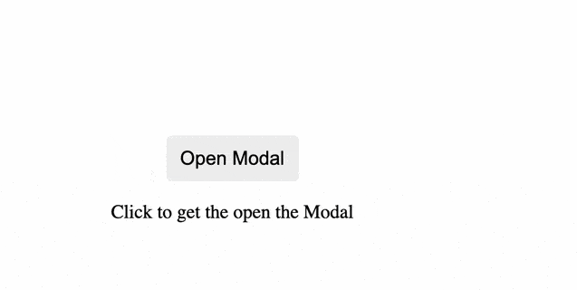
The visibility of the modal is bound by the “showModal” React state. The Modal component is hidden by default, hence the “setShowModal(true)” code displays the modal on the screen. The onClick event handler ensures that the modal is displayed each time the user clicks on the button.

<div>
  <button type="button" onClick={() => setShowModal(true)}>
    Open Modal
  </button>
</div>
<p>Click to get the open the Modal</p>

7) Add content to Modal

Inside the modal, the heading and description are displayed with user actions such as “Close” and “Success”. The handler function assigned to the onClick event is triggered each time the respective button is clicked.

<Modal
  className="modal"
  show={showModal}
  onHide={handleClose}
  renderBackdrop={renderBackdrop}
>
  <div>
    <div className="modal-header">
      <div className="modal-title">Modal Heading</div>
      <div>
        <span className="close-button" onClick={handleClose}>
          x
        </span>
      </div>
    </div>
    <div className="modal-desc">
      <p>Modal body contains text.</p>
    </div>
    <div className="modal-footer">
      <button className="secondary-button" onClick={handleClose}>
        Close
      </button>
      <button className="primary-button" onClick={handleSuccess}>
        Success
      </button>
    </div>
  </div>
</Modal>

Final Solution Code

App.js

import React, { useState } from "react";
import "./styles.css";
import Modal from "react-overlays/Modal";

export default function App() {
  // React state to control Modal visibility
  const [showModal, setShowModal] = useState(false);

  // Backdrop JSX code
  const renderBackdrop = (props) => <div className="backdrop" {...props} />;

  var handleClose = () => setShowModal(false);

  var handleSuccess = () => {
    console.log("success");
  };

  return (
    <div className="modal-example">
      <div>
        <button type="button" onClick={() => setShowModal(true)}>
          Open Modal
        </button>
      </div>
      <p>Click to get the open the Modal</p>

      <Modal
        className="modal"
        show={showModal}
        onHide={handleClose}
        renderBackdrop={renderBackdrop}
      >
        <div>
          <div className="modal-header">
            <div className="modal-title">Modal Heading</div>
            <div>
              <span className="close-button" onClick={handleClose}>
                x
              </span>
            </div>
          </div>
          <div className="modal-desc">
            <p>Modal body contains text.</p>
          </div>
          <div className="modal-footer">
            <button className="secondary-button" onClick={handleClose}>
              Close
            </button>
            <button className="primary-button" onClick={handleSuccess}>
              Save Changes
            </button>
          </div>
        </div>
      </Modal>
    </div>
  );
}

styles.css

.modal {
  font-family: arial;
}

.modal {
  position: fixed;
  width: 400px;
  z-index: 1040;
  top: 30%;
  left: 30%;
  background-color: white;
  border: 1px solid rgba(0, 0, 0, 0.2);
  border-radius: 3px;
  box-shadow: 0 5px 15px rgba(0, 0, 0, 0.5);
}

.backdrop {
  position: fixed;
  z-index: 1040;
  top: 0;
  bottom: 0;
  left: 0;
  right: 0;
  background-color: #000;
  opacity: 0.5;
}

.modal-title {
  font-weight: 500;
  font-size: 1.25rem;
}

.modal-header {
  border-bottom: 1px solid #e9ecef;
  display: flex;
  justify-content: space-between;
}

.modal-desc,
.modal-header,
.modal-footer {
  padding: 12px;
}

.close-button {
  font-size: 1.5rem;
  font-weight: 700;
  line-height: 1;
  color: #000;
  border: none;
  background-color: white;
  opacity: 0.7;
  cursor: pointer;
}
button {
  cursor: pointer;
  font-size: 1rem;
  padding: 10px 12px;
  border-radius: 5px;
  border: none;
}

.modal-footer {
  border-top: 1px solid #e9ecef;
  display: flex;
  justify-content: flex-end;
  gap: 8px;
}

.secondary-button {
  color: #fff;
  background-color: #6c757d;
}
.primary-button {
  color: #fff;
  background-color: #007bff;
}

.modal-example {
  height: 100vh;
  display: flex;
  justify-content: center;
  align-items: center;
  flex-direction: column;
}