In this article, we will learn how to add a tooltip using the “rc-tooltip” npm package. A tooltip is an overlay component that is displayed temporarily when triggered by an action. It is useful especially when certain text needs to be displayed without having to take up extra space on the screen.
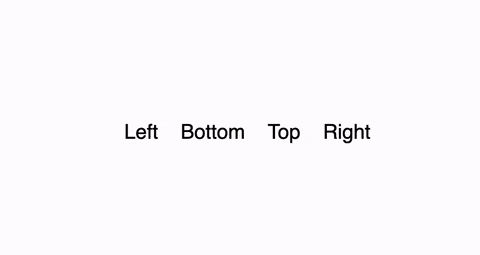
Tooltip built using rc-tooltip in React JS project
1) Add “rc-tooltip” npm package to package.json
The “rc-tooltip” npm package allows import of reusable <tooltip/> component. The package can be installed through the following command.
npm i rc-tooltip

// For projects configured with yarn
yarn add rc-tooltip
Once successfully installed the “rc-tooltip” package will be added as a dependency in the package.json.
2) Import external CSS styles
The tooltip requires CSS styles to display the text container and overlay effect. Hence, “bootstrap.css” is imported from “rc-tooltip/assets” which is external CSS file provided by “rc-tooltip” NPM package.
import "rc-tooltip/assets/bootstrap.css";3) Adding tooltip component
The HTML element which triggers tootip needs to wrapped by <Tooltip> component. Additionally, the JSX code which needs to rendered inside the tooltip is passed props for “overlay” attribute.
import Tooltip from "rc-tooltip";<Tooltip
placement="left"
overlay={<span>Hello World</span>}
>
<span>Top</span>
</Tooltip>4) Properties of <Tooltip/> component
The <Tooltip/> component can be customized by configuring additional props. Some of the essential props of <Tooltip/> are as follows:
- placement(string): Indicates the relative position from HTML element where tooltip overlay will appear. Default value: right. Possible valid value: [‘left’,’right’,’top’,’bottom’, ‘topLeft’, ‘topRight’, ‘bottomLeft’, ‘bottomRight’, ‘rightTop’, ‘rightBottom’, ‘leftTop’, ‘leftBottom’].
- overlay(React.Element): JSX code which is rendered inside the tooltip component.
- trigger(string | string[]): Action or list of actions that causes tooltip to be displayed. Default value: hover. Possible valid value: enum of ‘hover’,’click’,’focus’ .
- visible(boolean): Allows binding of the tooltip visibility with a variable or React state.
- mouseEnterDelay(number): delay time in seconds to display tooltip after mouse enters.
- mouseLeaveDelay(number): delay time in seconds to hide tooltip after mouse leaves.
Final Solution Code
App.js
import Tooltip from "rc-tooltip";
import "./styles.css";
import "rc-tooltip/assets/bootstrap.css";

export default function App() {
  var renderTooltip = <span>Hello World</span>;
  return (
    <div className="App">
      <Tooltip
        placement="left"
        overlay={renderTooltip}
      >
        <span>Left</span>
      </Tooltip>
      <Tooltip
        placement="bottom"
        overlay={renderTooltip}
      >
        <span>Bottom</span>
      </Tooltip>
      <Tooltip
        placement="top"
        overlay={renderTooltip}
      >
        <span>Top</span>
      </Tooltip>
      <Tooltip
        placement="right"
        overlay={renderTooltip}
      >
        <span>Right</span>
      </Tooltip>
    </div>
  );
}
styles.css
.App {
  font-family: sans-serif;
  text-align: center;
  height: 100vh;
  display: flex;
  align-items: center;
  justify-content: center;
  gap: 20px;
  font-size: 18px;
}
.rc-tooltip-content .rc-tooltip-inner {
  min-height: unset;
}


