In this article, we will learn how to build a simple accordion using React JS. The Accordion will have the following features:
- Hide body of accordian by default.
- Toggle visibility of accordian body on click on header.
To summarize, we will build Accordion in the following steps:
- Declare React State track visibility of accordion body.
- Display accordion body based on State value.
- Toogle state value on click of accordian header.
1. Declare React State with boolean value
There are two types of state for accordion, which will be represented by the “show” React state. The two possible values are as follows:
- show=false: Accordian Header allows expanding and Accordian body is hidden.
- show=true: Accordian Header allows minimizing and Accordian body is expanded.
// State to show/hide accordion
const [show, setShow] = useState(false);
2. Display Accordian Header based on State value
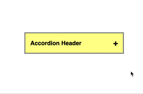
We need to show the “+” sign or “-“ sign in the Accordion Header Text to indicate whether the Accordion body can be expanded or minimized. We use the ternary statement “{show ? ‘-‘ : ‘+’}” to achieve the functionality.
<div>Accordion Header</div>
<div className="sign">{show ? '-' : '+'}</div>
3. Conditional rendering of Accordian body
React conditional rendering allows certain JSX codes to be returned only if a certain condition is satisfied. Although there are multiple ways to conditionally render, here we will use the “&&” operator along with the “show” React state.
This ensures div tag with className “accordian-body” is only rendered when show=true
{show && (
    <div className="accordian-body">
      Lorem Ipsum is simply dummy text of the printing and type setting
      industry. Lorem Ipsum has been the industry's ever since the 1500s,
      when an unknown printer took a galley of type standard dummy text
      and scrambled it to make a type specimen book.
    </div>
)}
4. Add onClick event to Accordian header
To achieve accordion functionality, we will create a JS function to toggle the “show” state value between true and false.
const handleOpen = () => {
  setShow(!show); // Toggle accordion
};
Next, the previously declared function will be added as an onClick event for the accordion header. Hence, the visibility of the accordion body is toggled when the header is clicked.
<div className="accordian-header" onClick={handleOpen}>
  <div>Accordion Header</div>
  <div className="sign">{show ? '-' : '+'}</div>
</div>
Final Solution Code
App.js
import React, { useState } from "react";
import ReactDOM from "react-dom";

import "./styles.css";

function App() {
  // State to show/hide accordion
  const [show, setShow] = useState(false);
  const handleOpen = () => {
    setShow(!show); // Toggle accordion
  };

  return (
    <div className="app">
      <div className="accordian">
        <div className="accordian-header" onClick={handleOpen}>
          <div>Accordion Header</div>
          <div className="sign">{show ? '-' : '+'}</div>
        </div>
        {show && (
          <div className="accordian-body">
            Lorem Ipsum is simply dummy text of the printing and type setting
            industry. Lorem Ipsum has been the industry's ever since the 1500s,
            when an unknown printer took a galley of type standard dummy text
            and scrambled it to make a type specimen book.
          </div>
        )}
      </div>
    </div>
  );
}

const rootElement = document.getElementById("root");
ReactDOM.render(<App />, rootElement);
styles.css
.app {
  font-family: sans-serif;
  display: flex;
  align-items: center;
  justify-content: center;
  height: 100vh;
  flex-direction: column;
  gap: 20px;
}
.sign {
  font-size: 25px;
}
.accordian {
  width: 300px;
  border: 1px solid rgb(133, 133, 133);
}
.accordian-header {
  font-weight: 600;
  font-size: 18px;
  cursor: pointer;
  display: flex;
  align-items: center;
  justify-content: space-between;
  padding: 15px 15px;
  border: 2px solid rgb(133, 133, 133);
  background-color: rgb(255, 255, 143);
}
.accordian-body {
  padding: 15px 5px;
}


