While building React applications, we might come across cases where a React component needs to be toggled between show and hide states. Conditional rendering combined with a React State will allow us to show/hide components based on the Boolean value assigned to the state.
In this article, we will create a React app to implement the following functionalities:
- Conditionally render JSX code of the screen.
- Display hidden React component on button click.
- Hide React component on button click
1. Create child component
First, we need to create a React component where the show/hide functionality will be implemented. In the code below, the Default component will display two lines of text enclosed in <h1> and <h2> tags.
import React from "react";

export default function Default() {
  return (
    <div className="default-container">
      <h1>Welcome to React</h1>
      <h2>Click below to toggle visiblity</h2>
    </div>
  );
}
2. Wrapper component to show/hide child component
The show & hide functionality is more generic since the implementation is similar irrespective of the child component. Hence, we will create a wrapper component that can be reused by other multiple components rather than repeating the functionality every time.
In the code below, the wrapper component ToggleVisibility accepts a child component from props to include it in the JSX code.
export default function ToggleVisibility({ children }) {
  return (
    <div className="component-container">
      {children}
    </div>
  );
}
3. React state to handle component visibility
The “show” state is declared to keep track of the component’s visibility. Every time setShow() function is called with the updated as the parameter, the ToggleVisibility component is re-rendered with updated state value.
const [show, setShow] = useState();4. Display button text by state value
The ternary operator is used to determine the button text as follows:
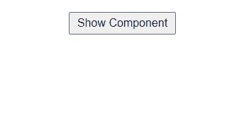
- Display text “Hide Component” when show is true.
- Display text “Show Component” when show is false.
var buttonText = show ? "Hide Component" : "Show Component";<button>{buttonText}</button>5. Toggle visibility on button click
The value of the React state is toggled simply by updating with “!show“. Therefore, every time toggleShow() function is called, the Boolean value of “show” state changes from true to false or vice versa.
function toggleShow() {
  setShow(!show);
}
The changes in React state must reflect the visibility of the component on the screen. Hence, the code “{show && children}” will ensure the following:
- Return empty JSX code “{}” when show = false.
- Return children JSX code “{children}” when show = true.
return (
  <div className="component-container">
    {show && children}
    <button onClick={toggleShow}>{buttonText}</button>
  </div>
)
6. Wrap child component in App.js
Wrapping “<ToggleVisibility></ToggleVisibility>” around Default component completes the implementation. Similarly, we can replace “<Default />” with any other JSX code where the show/hide functionality is implemented.
return (
  <div className="App">
    <ToggleVisibility>
      <Default />
    </ToggleVisibility>
  </div>
);
Final Solution Code
./components/Default.js
import React from "react";

/* React component where show/hide
  functionality is implemented */
export default function Default() {
  return (
    <div className="default-container">
      <h1>Welcome to React</h1>
      <h2>Click below to toggle visiblity</h2>
    </div>
  );
}./components/ToggleVisibility.js
import React, { useState } from "react";

export default function ToggleVisibility({ children }) {

  // React state to manage visibility
  const [show, setShow] = useState();

  // function to toggle the boolean value
  function toggleShow() {
    setShow(!show);
  }
  var buttonText = show ? "Hide Component" : "Show Component";

  return (
    <div className="component-container">
      {show && children}
      <button onClick={toggleShow}>{buttonText}</button>
    </div>
  );
}
App.js
import Default from "./components/Default";
import ToggleVisibility from "./components/ToggleVisibility";
import "./styles.css";

export default function App() {
  return (
    <div className="App">
      <ToggleVisibility>
        <Default />
      </ToggleVisibility>
    </div>
  );
}
styles.css
* {
  margin: 0;
  padding: 0;
}
.default-container,
.component-container {
  display: flex;
  flex-direction: column;
  justify-content: center;
  align-items: center;
}
.default-container {
  gap: 20px;
}
.component-container {
  margin-top: 30px;
  gap: 20px;
}
button {
  padding: 5px 10px;
  font-size: 16px;
}


