The “react-select” library provides custom select HTML input components controlled by React state. The <Select> component allows search, and multi-select functionalities through the following props:
- options: array of objects with “label” and “value” properties which can be selected from the dropdown.
- value: React State to control and bind the value of the <Select> component.
- onChange: JavaScript function which is triggered every time the user inputs are changed.
- placeholder: Placeholder text displayed when the input selection is empty.
- isSearchable: Boolean value to allow/disable users to search through dropdown options.
- isMulti: Boolean value allows/disables users to select more than one option.

1. Add “react-select” npm package to package.json
Once the “react-select” library is installed, the <Select/> component can be imported and used across the React application. Every npm package which is successfully included in the React project is declared as a dependency in the package.json file.
If the “react-select” dependency is absent from package.json, you must run the following the script in the terminal:
npm i react-select

// For projects configured with yarn
yarn add react-select
Learn more regarding the installation of the ‘react-select’ npm package from npmjs.com/package/react-select.
2. Declare the dropdown options
The <Select/> component requires an array of option objects which is displayed in the dropdown list. Each option object has two properties:
- value: The string/number value associated with the option.
- label: The string value displayed in the dropdown list.
The array of options is associated with a JavaScript declaration when the dropdown options are static. For dynamic options, React state must be used to ensure that the dropdown options are updated on the screen.
const optionList = [
  { value: "red", label: "Red" },
  { value: "green", label: "Green" },
  { value: "yellow", label: "Yellow" },
  { value: "blue", label: "Blue" },
  { value: "white", label: "White" }
];
3. Include <Select/> component in the JSX code
The <Select/> component is an external React component available through the import of the “react-select” npm package. Once the <Select/> component is included in the JSX code, it renders a dropdown list based on the values passed as props.
In the below example, the previously declared constant “optionList” is passed as the dropdown options, and “Select color” string is passed as placeholder text.
return (
  <div className="App">
    <h2>Choose your color</h2>
    <div className="dropdown-container">
      <Select
        options={optionList}
        placeholder="Select color"
      />
    </div>
  </div>
);
4. Bind React state with <Select/> dropdown value
The <Select/> component is uncontrolled by default and the value selected by the user cannot be accessed without HTML DOM methods. Therefore, binding the <Select/> component with React state ensures that the selected value is accessible through the state value and the selection can be controlled using the setState() method.
const [selectedOptions, setSelectedOptions] = useState();The React state needs to be passed as the “value” prop for the <Select/> component.
<Select
  options={optionList}
  placeholder="Select color"
  value={selectedOptions}
/>
5. JavaScript function to handle onChange events
React uses one-way data binding, hence the changes from users do not directly update the selected value. Thus, setState() must be called with an updated value in a handler function which is triggered through the onChange event. As a result, the React state is updated every time a new selection is made and the dropdown list is re-rendered with the updated value.
The selected option is received as the argument for the JavaScript handler function and passed to setState() method.
function handleSelect(data) {
  setSelectedOptions(data);
}
Previously declared JavaScript handler function as passed as onChange prop for the <Select/> component.
<Select
  options={optionList}
  placeholder="Select color"
  value={selectedOptions}
  onChange={handleSelect}
/>
6. Enable search functionality
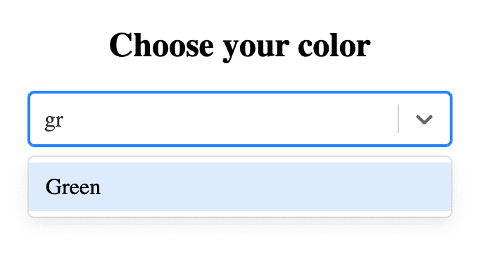
In the <Select/> component, the search functionality is enabled by default which can be overridden through isSearchable prop. This feature allows users to search/filter dropdown options by user text input. The searchable dropdowns are very ideal and offer a better user experience when the list of dropdown options is large.
<Select
  options={optionList}
  placeholder="Select color"
  value={selectedOptions}
  onChange={handleSelect}
  isSearchable={true}
/>
7. Allow dropdown options to be multi-selected
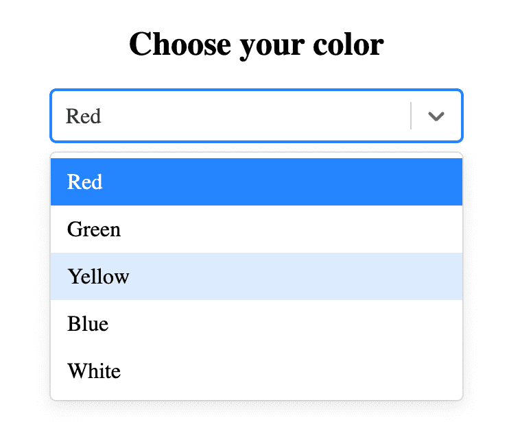
The default dropdown list rendered by <Select/> component only allows a single option to be selected from the list. The below screenshot refers to a single select dropdown where a new selection replaces the previously selected value.
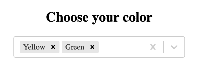
In a dropdown where the multi-select feature is enabled, every new selection is appended to an existing list of selected options. Additionally, any selection from the list can be reversed by clicking on “X” icon.
In the <Select/> component, multi-select feature is enabled by simply passing a “true” value to “isMulti” prop.
<Select
  options={optionList}
  placeholder="Select color"
  value={selectedOptions}
  onChange={handleSelect}
  isSearchable={true}
  isMulti
/>
Final Solution Code
App.js
import React, { useState } from "react";
import "./styles.css";
import Select from "react-select";

export default function App() {
  // React state to manage selected options
  const [selectedOptions, setSelectedOptions] = useState();

  // Array of all options
  const optionList = [
    { value: "red", label: "Red" },
    { value: "green", label: "Green" },
    { value: "yellow", label: "Yellow" },
    { value: "blue", label: "Blue" },
    { value: "white", label: "White" }
  ];

  // Function triggered on selection
  function handleSelect(data) {
    setSelectedOptions(data);
  }
  return (
    <div className="app">
      <h2>Choose your color</h2>
      <div className="dropdown-container">
        <Select
          options={optionList}
          placeholder="Select color"
          value={selectedOptions}
          onChange={handleSelect}
          isSearchable={true}
          isMulti
        />
      </div>
    </div>
  );
}
styles.css
.app {
  display: flex;
  flex-direction: column;
  justify-content: center;
  align-items: center;
  height: 100vh;
}
.dropdown-container {
  width: 300px;
}


 for Array of objects")
